
For organizing and presenting data, Excel Tables are incredibly handy. These sheets can also be aesthetically pleasing and eye-catching by formatting them using the Excel tools that are available for you. And among quite a few Excel users, there is a common question that everyone asks – how to make Excel tables look good?
If you want to make Excel tables look good, then you can try using the inbuilt predefined Table Styles to format a Table fast. You can also do a lot of other things to make the table look good, for example, changing the theme and color of the workbook, adding a Total Row button, and so on.
Spreadsheets, like paintings, are intended to be read and understood by the targeted users. They serve as a means of communication. In addition to looking attractive, well-designed spreadsheets are also simple to grasp. So, keep reading this guide until the end to learn more in detail about making an Excel spreadsheet look good.
How to Create A Table In Excel
Before we move on to the main topic of this how to make Excel tables look good guide, the first thing we need to do is to create a table in Excel. So, go and create one, or follow the below steps carefully to know how you can easily create a table in Excel:
- Open your Excel spreadsheet and select a cell in the data range.
- Now navigate to the Insert tab and click on the Table also, you can press Ctrl + T on your keyboard.
- The Create Table Dialog Box should now open, and if the data is entered properly, Excel should immediately discover the data for the Table and fill the table with it. By default, My table has headers selected, by the way.

- Hit on the OK button, and the table will be created immediately.
Once you are done creating the Table, it would be great to name the Table, particularly if your worksheet has a large number of tables. If you want to give it a name, select a cell in the table and navigate to the Table Design tab. Now on the Properties section, you can rename it as you want.

How to Make Excel Tables Look Good
If you have created the Table of your data, it’s time to make it look good and professional. There are so many different ways to customize a table. Below down, we showed some of the best ways to make an Excel table look good. Let’s check it out.
1. Use the inbuilt Table Styles to format the Table.
If you are lazy like me, then you can use the pre-built table styles to customize the table and give it a look quickly. In Excel, there are a lot of Tables styles that are able to make any excel tables look good.
To use the table styles, follow the steps below:
- Open the Excel file and select one of the cells in the middle of the table.
- After selecting a cell, navigate to the Table Design.
- On the Table Styles section, click on the down arrow to expand the drop-down menu of many inbuilt table styles.

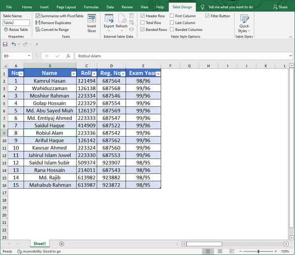
Now you have the option of selecting one of the built-in Table Styles that are offered. If you are unsure about a style, you may see a preview by just hovering your mouse over it. In our worksheet, we have used the Blue, table style medium 13.
Right after selecting the style, your whole spreadsheet will be changed into the style that you have chosen. Also, the colors and fonts that have been applied to the sheet will be drawn from the default office theme.

2. Change the Theme
You can change the whole appearance of your worksheet by changing the theme. Like the table styles, there are a lot of interesting and aesthetic-looking themes available in Excel only for you.
However, keep in mind that if you have already done the previous method, and selected a table style, then applying this method (changing the theme) will undo some of the changes. But don’t worry, the end result will always be satisfactory.
Hence, if you want to change the theme, follow the steps below:
- Open your Excel file and navigate to the Page Layout.
- Click on the drop-down menu in the themes section, and you will get a lot of theme options.

Now select another theme that is not the default office theme. In our worksheet, we have chosen the Gallery theme. It has changed the font style, color, and so on.
When you change the theme from Office to Gallery, you will notice a difference in all of the Table Styles options. To see this, select one cell in the table and navigate to the Table Design > Table Styles and click on the drop-down arrow. This will show you the alternate color schemes that have been drawn from the new theme.
3. Customize the Theme Color
If you are a lazy worker, then the previous method would be the best way to make your Excel table look good. But if you are okay with doing some extra modifications and steps, then this method is going to give you some satisfactory results.
By changing the theme, you can indeed alter the appearance, but the colors and fonts are pre-defined. But if you want to change the fons and colors and effects as you wish, you can do that as well.
To change the colors, fonts, and effects, follow the below steps:
- Open your Excel file and navigate to the Page Layout tab like the previous method.
- Now, next to the Themes, click on the Colors drop-down menu and click on the Customize Colors.

- The Create New Theme Colors dialog box will appear. Pick More Colors… from each of the Text/Background options and customize the colors according to your needs.
If you don’t know which color would be best, then we can give you some suggestions. Follow the steps below:
- Pick More Colors… from under the drop-down arrow next to Text/Background – Dark 2.
- Choose the Custom Tab and input the following values: Red – 87, Green – 149, and Blue – 35 in order to get the dark green hue you like. Then, hit the “OK” button.

- Then, in the Create New Theme Colors Dialog Box, pick More Colors… from the drop-down menu next to Text/Background – Light 2.
- To create the orange color, choose the Custom Tab and input the following values: Red – 254, Green – 184, and Blue – 10 in the appropriate fields, then click OK.
- Then, in the Create New Theme Colors Dialog Box, pick More Colors from the drop-down menu next to Accent 1.
- If you want to use the dark turquoise hue, choose the Custom Tab and input the following values: Red – 7, Green – 106, and Blue – 111. Then click Ok.
- Now, in the Create New Theme Colors Dialog Box, pick More Colors from the drop-down menu next to Accent 2.
- To create the pink color, choose the Custom Tab and input the following values: Red – 254, Green – 0, and Blue – 103, followed by the button “OK.”
Now, it’s time to give it a name for your newly created theme color palette and save it.

The result of modifying the theme colors to this personalized palette will instantly be reflected in our Table.
Moreover, this new color customization is also shown in the Table Styles Options, which can be accessed by heading to Table Design>Table Styles and clicking on the drop-down arrow to view the new Table Styles that are taken from the new customized theme colors set.
4. Create Your Own Table Style
In Excel, you may design your unique Table Style and use it to perfectly design the header row, the columns, and the rows in the Table. In this way, you won’t have to use the prebuilt styles, and you can customize the table as you want.
So, to create your own table style, follow the steps below:
- Open your Excel file and select a cell in the table.
- Navigate to the Table Design > Table Styles and click on the drop-down arrow next to it, and hit on the New Table Style

- Individual items of the Table may now be formatted using the New Table Style Dialog Box, which has appeared.
- The very first item we will now format is the Whole Table Choose the Whole Table option, and then select Format underneath that section.

- The Format Cells Dialog Box should now open; choose the Font Tab and then the Bold Italic font type from the font style menu.

- Select More Colors from the Background Color menu on the Fill Tab…
- Go to the Custom Tab and enter the values Red – 133, Green – 229, and Blue – 255, then click OK to save your changes.

- Select OK once again.
- Click Format once you’ve selected the Header Row element (as seen in the image below).
- Like the previous step, the Format Cells Dialog Box should open. Select the Font tab, then pick Bold from the Font Style menu, and set the font color to White, Background 1.
- Select the Border Tab, then choose the thick line style and the colors Gray – 25%, Background 2, Darker 50%.

- Now, select Outline in order to outline the whole Header Row with this border style.
- Next, pick the Fill tab and, under Background Color, select More Colors.
- Select the Custom tab and enter the values Red – 11, Green – 135, and Blue – 52, then press OK.
- Select OK once more.
Now, like the previous method, it’s time to assign your new Table Style a name and choose the option to make it the default table style for this document. This will guarantee that all tables made in the workbook are formatted in this manner, which will lead to a more simplified appearance overall.
5. Remove the Filter Arrows
When you first create the table on the spreadsheet, it will give you a filter arrow on the headings. Some may mind this thing useful, but if you are like me, then you will see this thing as an eyesore. So, the first thing we need to do to make an Excel table look good is to remove the filter arrow from the headings.
So, to remove the filter arrows, follow the steps below:
- Open your Excel file and select one cell of the table.
- Now click on the Table Design and uncheck the Filter Button option on the Table Style Options

Also, you can do the same thing by clicking on a cell inside the table and then selecting the Data tab > Sort & Filter > Filter from the above tab bar. You can now switch between hiding and displaying the arrows with a single click, rather than having to click each time. On the other hand, the keystroke combination Shift + Ctrl + L performs the same result as the full keyboard shortcut.

You can also disable the filter arrow on the Home tab. Click on a cell in the table, and on the Home tab, click Sort and Filter. Now hit on the Filter button to toggle off the filter arrows.

6. Add Total Row
In an Excel table, you have the option to add a total row automatically, which will save your time. If you’ve ever attempted to use the SUM function to sum a column of data in which parts of the rows are hidden, you’ve likely encountered an unpleasant surprise. In a range of cells, even if they are visible or not, the SUM function calculates the number of all of the cells in that range.
Therefore, if you use this old method, to sum up, all visible rows, you will get a different result than you expected. The SUBTOTAL function, on the other hand, may be used to prevent this problem. When you utilize the Total Row option for your table, Excel will take care of this for you.
Now, if you want to add Total Row, select the table, right-click, and select Table > Totals Row from the context menu that appears. Alternatively, click within the table and then select Table Design and check the Total Row option from the Table Style Options. Regardless matter whether the option is selected, a total row will be shown at the end of the table.

If the last column includes numerical values, Excel will instantly apply the SUBTOTAL function to total the numbers in the column before the final one.
If you want to add some other functions to the other columns as well, click on that column and hit the drop-down arrow. It will show you a lot of functions that you can use. Click on your preferred one, and Excel will instantly apply the formulas. There are many other calculation choices available from this drop-down menu that includes Min, Max, Count, and Average.
7. Use Charts
Charts are an excellent choice for delivering a rapid visual representation of facts while also helping the reader’s perception. 2D charts, sometimes known as ‘Flat charts,’ are unquestionably more appealing than a large table of figures, provided that they are used.
2D charts have a considerably neater and more modern appearance, in addition to the fact that the data contained inside them can easily be read. Because of the method 3D charts function, it’s practically hard to determine the size of bars or columns, and particularly lines, which seem to be flying in space due to the way they are shown.
That’s why make use of 2D charts to present your information in a well-organized way; however, avoid employing 3D charts.
8. Resize Rows and Columns
You may give your worksheet a special touch by separating rows and columns and leaving enough space for the data to be understandable! Personally, and this is also the average audience’s perspective (we have studied a lot regarding Excel ), information heaped up in little cells seems crowded and unattractive, and the reader will quickly get disinterested in the data.
For information to be read, cells carrying the information must be large enough. A visual separator may be created by leaving empty cells/rows/columns in your spreadsheet. So, if you want to attract the most attention, leave many rows or columns and adjust their size to a few pixels, which may be changed afterward.
9. Be Gentle with Colors
When it comes to spreadsheets, it is commonly known that the more colors there are, the poorer the presentation. White is the greatest color to use as a background. Black letters on white attract the greatest amount of attention and are the most popular choice among individuals. When black is the default color, such as in charting (labels, ruler, grids bars, etc.), use a shade of brown instead; it will be emphasized, will be less startling than black, and will have a more “modern” look and feel.
Whenever you’re dealing with colors, choose a certain accent color and utilize it across the whole worksheet. Accents that are less vivid tend to appear better. The use of numerous colors in charts is permitted and encouraged since it allows for greater differentiation across the groups. In fact, Excel isn’t very helpful when it comes to colors because a large number of colors were introduced to the revised Excel 2007, ranging from a few 64 to almost infinite shades.
It causes users to desire to utilize as many colors as possible, and in many cases, all of them. However, NO! Just because you have many options doesn’t mean you have to settle for anything less than what you want.
10. Turn Off Gridlines, Headers, And Chart Borders
Switching off the gridlines and row/column headings is at the top of our prioritized list of stuff to do to make our spreadsheet work better. If you have properly organized your information, you will have all of the borders you require, and the inclusion of more gridlines will just make the situation seem cluttered.
Also, the row/column headings serve as a continual signal that you’re working in Excel, but when you’re merely reading a spreadsheet and not writing it, you don’t need to be reminded of this. Remove all of the borders from the charts while you’re at it; the graph will look much better when it’s simply “on the background” of the spreadsheet.
To turn off the gridlines, follow the steps below:
- Open your Excel spreadsheet and click on a cell of the table.
- Now navigate to the Page Layout tab and uncheck the View option on the Gridlines section.

Frequently Asked Questions (FAQs)
How to create a table in Excel?
You can easily create a table in your Excel spreadsheet. Just select a cell in the data range and click Ctrl + T. Now the table will be created instantly.
What’s the easiest way to make a table more visually appealing?
You can use the Table Styles to make a table more visually appealing. This is the easiest way to make an Excel table look good.
Conclusion
Despite the fact that tables may be created and styled in a variety of ways in both Excel and Word, formatting tables for aesthetic appeal or printing reasons is sometimes required. If you put just a little more effort, you can significantly enhance the appearance and readability of your spreadsheets.
In this guide, we tried to show you some of the best ways through which you can know how to make Excel tables look good. We hope this article has helped you make your Excel spreadsheet more visually appealing.

