No doubt that graphs add value to your presentation. But in the modern world, everyone is copying the templates.
That said, you have to build something unique to stand out from others.
That’s where we can help you.
If you have one or multiple dataset, you can easily make a double line graph in Excel. Build a unique dataset for practice and you are ready.

What is a Double Line Graph Called?
A double line graph is a type of Cartesian graph that uses two lines to represent two sets of data. So, while a double line graph is a type of Cartesian graph, not all Cartesian graphs are double line graphs.
Remember in high school, we learnt about Co-ordinate planes?
It was a type of graph that shows the relationship between two variables.
Similarly, a 2 line graph is used to compare two sets of data, typically over time. Widely, Multi-line graphs are often used in business, finance, and economics.
So now, let’s get to know how to make a two-line graph in Excel.
Making A Double Line Graph in Excel
You don’t need a double line graph generator to solve this problem. The perfect way to create one is by creating a good dataset.
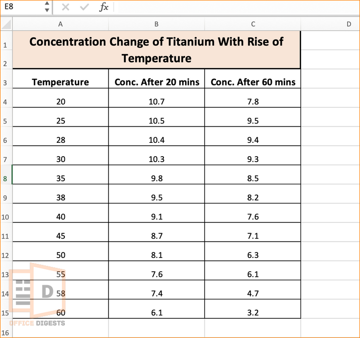
Let’s look at an example and then start the step-by-step process.

Now, we will be creating two lines based on the temperature. So, temperature is our constant function and the concentration change is our variable here.
That said,
We will place the Temperature in the X-axis and the Change of concentration in the Y-Axis.
So, here are the steps to making a double line graph:
1. Select The Perfect Line Graph
There are a lot of line graphs in Excel. You can use a 2D line with or without markers. Alongside, you can create a 3D graph as well (an extra Z-axis will be created).
In this example, we will be using a 2D line with markers. So, select an empty cell and go to the Insert Tab from the Ribbon bar. Select the Line icon (next to recommended charts). Click on the 2D Line with Markers option.
A blank box will appear, blocking a specific amount of cells. Drag the box if you want to make your graph look bigger.

2. Add The Horizontal And Vertical Values
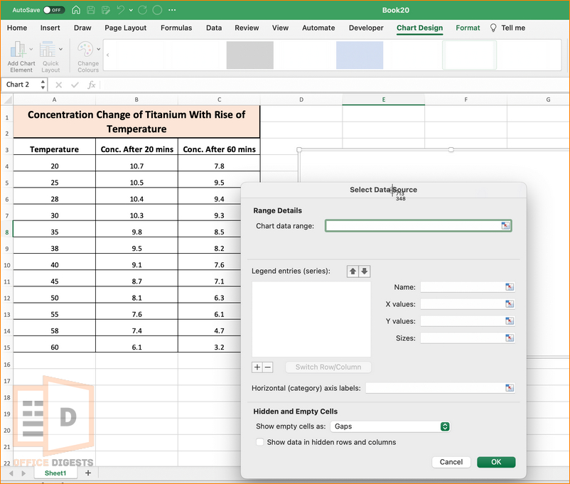
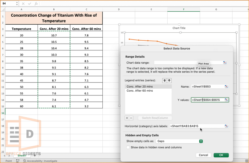
Right-click on that white box and click on Select Data. This will open up the Data Source dialog box. Select the whole table as the Chart Data Range.
Select the Temperature range as the horizontal (category) axis labels and the change in concentration as the Y-values.
QUICK TIP: You can also select the whole data at first and then click on the Insert Tab > 2D Line with markers to get the graph pre-made.

3. Add Chart Elements
Chart Elements can be added from the Chart Design Tab. Select the chart and click on Chart Design from the Ribbon bar.
At the leftmost-side, you will have an option called Add Chart Elements. Add any of the necessary elements, including chart titles, axes titles, grid lines, marker lengths, trend line, and many more.
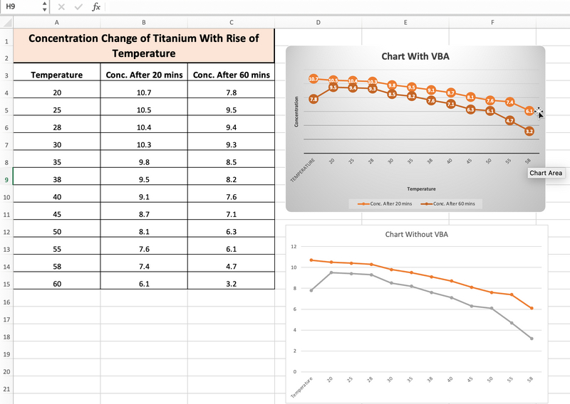
If you don’t want fainted lines in your graph, you can remove the gridlines within the graph.
VBA Code To Make a Double Line Graph
The code we will be using is User-Defined. That is, we made this code. If you want, you can practice using our code. Or you can create any modified or updated version of it.
The first thing you need to do is enable VBA in Excel through the Settings.
After that, go to the Developers Tab and Select the Visual Basic Option. Insert a new module in your current workbook.
Copy the following code-
Sub Make_Double_Line_Graph()
    Dim TempData As Range
    Set TempData = Range("A2:C13") 'Set the range for the data
    'Create a new chart and select it
    Dim NewChart As Chart
    Set NewChart = ActiveSheet.Shapes.AddChart2(251, xlLineMarkers).Chart
    NewChart.SetSourceData Source:=TempData
    'Format the chart
    With NewChart
        .HasTitle = True
        .ChartTitle.Text = "Concentration Change of Titanium with Rise of Temperature"
        .Axes(xlCategory).HasTitle = True
        .Axes(xlCategory).AxisTitle.Text = "Temperature"
        .Axes(xlValue).HasTitle = True
        .Axes(xlValue).AxisTitle.Text = "Concentration"
        .Axes(xlValue).MinimumScale = 0
        .SetElement (msoElementPrimaryValueGridLinesNone)
        .SetElement (msoElementLegendBottom)
        .SeriesCollection(1).Format.Line.Weight = 2 'Set the line thickness for the first series
        .SeriesCollection(2).Format.Line.Weight = 2 'Set the line thickness for the second series
    End With
End Sub
Paste the code in the module and Click on the Save Button. Make sure the file type is macro-enabled.
Modify the Range of the code according to your dataset.
Press the F5 button to RUN the code. You can also click the Run Button at the leftmost top corner.

Explanation of the Code:
The code basically adjusts the following criteria:
- The code sets the range for the data in cells A3:C15.
- Creates a new chart using the range and sets it to be a double line graph with markers.
- The Code formats the chart with a title, axis titles, and minimum scale for the y-axis.
- Removes the primary value grid lines and places the legend at the bottom of the chart.
- Sets the thickness of the lines for both series.
FAQ
Q: Can you have 2 lines on a line graph?
A: Yes, it’s easy to have two lines on a line graph if you have two different datasets. Select the entire table at once and then click on the Insert Tab. Select the Graph and make necessary adjustments.
Conclusion
In this post, we saw two ways of making a 2-line graph in one excel graph. One is the traditional method, and the other is by using a user-defined VBA code.
The VBA Code is not recommended if you are a total beginner and want to practice. The traditional way is the best way. So, go through our posts to polish your skills.


